If iPod were sold by Microsux, how would it look? Just by glancing at the packaging, you can notice a significant contrast. In this post, I’ll throw out an interesting thought – envisioning how the Apple gadget would transform if it fell into the hands of Moco$oft.
Currently, I doubt anyone hasn’t encountered or is unaware of the iPod‘s existence. Moreover, some might even know that this nifty gadget isn’t crafted by the almighty Micro$oft but is, in fact, an Apple product. Notably, there are significant differences. While Bill Gates‘ company tends to pack their products with all sorts of bells and whistles,, Steve Jobs‘ company adopts a more understated style for their products – and the iPod is no exception. Specifically, in the case of this music player, they chose the classic white color.
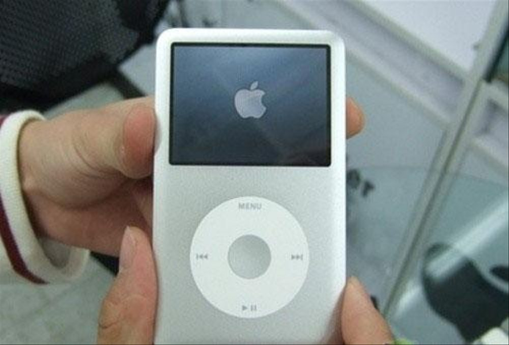
Certainly, the success of a product intricately links to the allure of its minimalist design. Moreover, this gadget communicates effectively with its understated aesthetic, and choosing the sleek aluminum hue was undoubtedly a brilliant decision. On the flip side, some individuals appear to prefer the cluttered approach. A mishmash of colors, an abundance of text everywhere you look. However, a product that doesn’t hyper-market itself in presentation wouldn’t quite align with the Micro$oft product mold, a point the following video abundantly clarifies.
Meet you at the next entry.